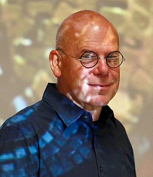
Bio
I am an art historian by profession, so it’s no surprise that my paintings, whether representational, abstract or some hybrid of the two, are informed by historical precedents. I have lived in a constant condition of privilege: born into an academic German-Jewish/Norwegian-American family and raised in the early 20th-century Spanish-villa ethos of West Los Angeles; enjoying from my earliest years long, frequent, and comfortable stays in London, Freetown, Paris, Bonn, Vienna, Florence, Beijing . . . I received my bachelor’s from Harvard, my master’s from UCLA, and my doctorate from Columbia University in New York (all in art history), and I followed a course in classical figure-drawing at the Accademia Nerina Simi in Florence, Italy (receiving my credenziale in disegno in 1978). I went on to teach at various California State University campuses before taking a tenured position at Southwestern Oklahoma State University in 1997. In 2005 I migrated back west, settling in Cedar City, Utah as Southern Utah University’s Professor of Art History. In 2011 I married a brilliant, beautiful medical researcher, NIH Fellow and UPenn postdoc, and took on parenthood to two remarkable kids. Over the past few decades I’ve published a dozen or so papers on various aspects of the transition from traditional to modern art that took place in Europe and America between 1880 and 1920. (See below for a comprehensive list of my scholarly work.) And I’ve painted almost daily for about a half-century. My productivity as an artist falls neatly into three separate periods: a traditional representational phase that lasted until 1989 (it included figure studies and portraiture, still-life work and plein-air landscapes, all in oils); a period (from 2004 to 2019) of abstract and non-representational modes of expression; and a new stage, which began in 2019, fusing representational work with some of the premises of abstraction. I am at home in both, and I see no good reason for the conflict which some feel persists between them. For me, painting is a natural and indispensable way of responding to life. I see the formal language of art as a universal one, independent of its content; and, when practiced serendipitously, that language can communicate ideas as precisely as any other.
Publications and scholarly activity:
“Representing the vortex: Delacroix’s critique of Poe’s sublime,” co-written with Louis Wirth Marvick, RomantiK (Reykjavik, Iceland), Vol. 9, No. 1 (December 2021) 75-96
“Hilma af Klint, Georgiana Houghton, and the Symbolist roots of modernism,” paper presented for Symbolist Currents in the 20th and 21st Centuries (ALMSD panel), CAA, February 12, 2021
“Flatness and anxiety at the edges of Symbolist art,” in Rosina Neginsky, ed., Symbolism: Its Origins and Its Consequences 2: Symbolism and Anxiety, Newcastle (UK): Cambridge Scholars, 2020
“Losing One's Self(ie): Facial obliteration in contemporary art,” presented at the Conference on the Image VIII, San Servolo, Venice, October 31, 2017
Un-Selfies: The Dissolution of Identity in 20th- and 21st-Century Art, published by the Grace A. Tanner Foundation as part of its Distinguished Faculty Lectures Series, Southern Utah University Press, 2017
“The Faceless portrait: Absence and anonymity in modern abstraction,” in Talbot, Jonathan, ed., Identity and Anonymity: An Artful Anthology, New York: Mizzentop Press, 2016
“Un Coup de dessin: Looking at the blanks in Mallarmé and Khnopff,” in Thor Mednick and Michelle Facos, eds., The Symbolist Roots of Modernism, Ashgate Press Ltd, July 2016
“«Un trou dans la filière»: Flatness and anxiety at the margins of Symbolist form,” presented at ALMSD, Université de la Sorbonne, Paris, June 2015
“The Sisters of Atalanta: Distortion of the classical ideal in fin-de-siècle art,” presented at CAA, Chicago, February 2014
“The Collage artist in the 21st century: Is a modernist eclecticism possible?” In Snider, Deborah K., The Collages of Jonathan Talbot, Southern Utah University Press, 2014, 24-29
“«Repousser tout paysage sauf à la Poussin»: Classical form in the art of Khnopff and Mondrian,” presented at CAA, Los Angeles, February 2012
“Luigi Lucioni (Italian-born American, 1900-1988): Still life spins an intriguing tale of beginnings,” in Cincinnati Art Museum Member Magazine, Fall/Winter 2012, 32-35
«'Images latentes’ et ‘implications ingénieuses»: modernisme formel et le réel dans les paysages de Fernand Khnopff,» presented at CIÉF, Aix-en-Provence, 2011
“‘Something incomprehensible’: Symbolism and the real in the landscapes of Fernand Khnopff,” in Rosina Neginsky, ed., Symbolism: Its Origins and Its Consequences, Newcastle: Cambridge Scholars Publ., 2010
“Lines drawn: Delacroix and Poe,” paper co-written with Louis Wirth Marvick, presented at the International Conference in Humanities, Honolulu, Hawaii 2008
“‘Alone in his haughty solitude’: Reception of Khnopff's formalism, 1895–1922,” presented at MMLA, Cleveland 2007.
“‘A Strange sadism of the pencil’: Formalist pedagogy in fin-de-siècle art criticism,” presented at ORT, Oxford, UK 2007
“‘No life is complete without vice, and technique': Late Victorian reception of pictorial form,” presented at MLA, Philadelphia 2006
“‘Patches of black blot’: Reception of space in Beardsley and Khnopff,” in Karen Sayer, ed., Pre-Raphaelite Space(s): Leeds Centre Working Papers in Victorian Studies, Vol. 8: Spring 2006, 154-161
“‘A Strumous young lady of no high breeding’: Reception of the female adolescent in late Victorian painting,” presented at NCSA, Augusta 2005
“‘Resisting a groove’? Waterhouse and his public after 1884,” in Paul Hardwick and Martin Hewitt, eds., The Pre-Raphaelite Ideal: Leeds Centre Working Papers in Victorian Studies, Vol. 7: Spring 2004, 76 – 88
“‘Herself a Psyche’: Feminine identities in the art of J.W. Waterhouse,” in The Journal of Pre-Raphaelite Studies, new series Vol. 5: Spring 1996, 81-94
The Art of John William Waterhouse, R.A.: Eclecticism in Late Nineteenth-Century British Painting, doctoral dissertation, Columbia University, New York, 1994
“American artists and Holland: The late nineteenth century,” in Maurice Bloch, ed., The Dutch and America (exhibition catalogue), Grunwald Center for Graphic Arts: UCLA Publications, 1982
“American painters of interior subjects: 1880 - 1920,” master’s thesis, Los Angeles: UCLA Publications, 1982
Methods and Media

I’m occasionally asked how my abstract paintings are made and what materials I use. My chief starting-points come from a broad variety of published texts — including scholarly publications in art history, philosophy, physics, archaeology, botany and the like; poetry and poetic prose; and popular verse. Underlying these cues from language are the impressions I have of existing works of art from any number of sources. I apply some measure of structure to a surface in an effort to make the idea visible. I sometimes allow for the introduction of a series of accidents. Over the years my familiarity with the effects of these latter has grown, such that random events now only rarely defeat me, and are usually my allies. I used to reject 90 percent of my efforts; nowadays I finish more than half of what I begin.
When painting in a representational way, my procedure is much simpler: I put an object of interest before me on a neutral, well-lit surface; and I paint what I see, avoiding as fully as I can everything I have learned of the traditional western principles of design in an effort to allow a plainer, less self-conscious truth to emerge.
For my abstractions I mainly paint with watercolors on texture-enhanced surfaces; I've explored painting on a broad range of papers and fabrics over the past twenty years or so. My current preferred surfaces are: 300-lb. extra-white watercolor papers from Arches (for rough grain), Fabriano Artistico (for hot-press) and Kilimanjaro (for cold-press). I also use a soft 90-lb. hot-press paper from Spain’s Garzapapel. From Amatruda, which is loated on italy’s Amalfi coast, I often use a light-weight moulded paper good only for very swift, light washes but beautiful in its own right. And I use a paper from Calligrane, a small independent French firm which makes a similarly light, velveted product. I get another variety of desired effects from the impressively dense and hard 140-lb. Twinrocker feather-deckled hot-press papers. An entirely different terrain for watercolor than the mould- and handmade cottons, but no less exciting in its own way, is the synthetic substrate from the Japanese manufacturer Yupo, and I paint on it from time to time. I also take an occasional bumper-car ride on Indian rag papers like those distributed under the Shizen and Khadi brands – these have very inconsistent surfaces, and they can deteriorate at a swift rate under the solvent weight of water, but these eccentricities are not always unwelcome liabilities in my creative process.
For watercolor paints, I use almost exclusively single-pigment products in order to maximize the saturation of color in my paintings. This is necessary because nearly all of my imagery will darken during later stages. I favor the German-made Lukas Aquarellfarben1862 and Marcello Dworzak's new formulas of American-made Da Vinci-branded paints. Winsor & Newton Professional, Daniel Smith Extra Fine are excellent, well-known brands, but generally not better than either Da Vinci or Lukas, which are more reasonably priced. There are also some exceptional artist-grade tube paints from M. Graham, Maimeri Blu and Holbein. Like many other professional watercolor artists, I pay attention to the critical analyses and recommendations of Bruce MacEvoy at handprint.com. For oil paint, my main stock is from Blue Ridge, Williamsburg Handmade, Daniel Smith Extra Fine and Sennelier Huile Extra-Fine. For drawing I use willow charcoal and graphite on cheap Bristol. My inks are Pilot's “Iroshizuku” ("Color-drop") take-sumi, as well as the German Kaweco and French J. Herbin 1798 lines of cartridge inks.
I use the cheaper brands of student-grade brushes because my treatment of them is too neglectful to justify better quality, and because I seldom leave a brushstroke unadjusted by a touch from a paper towel or a finger-tip. I spend a lot of time dripping, glopping and dabbing with a wide variety of sizes, glazes, mediums, gels, varnishes, turps, saps and lacquers from Polyvine, Golden, ProCeed, Perfetto, DecoArt, Adicolor, Delta, Gamblin and Sinopia. I work either on pristine paper surfaces or on more durable substrates that can withstand the addition of pumices, marble dusts, mica, gessoes, plasters and other adulterants. Finally, depending on my patience with the process, my activity in the studio may draw to a close with the reckless application of dry heat, which can have a satisfyingly deleterious effect on my surface textures.
Until 2008 oil was my primary medium, but since then I've signed only a few dozen medium- and large-scale oil paintings. Beginning around 2009 the purity and delicacy of watercolor began to suit my aims. The shift to watercolor as a primary medium, following a decades-long commitment to the European oil tradition, has led me to hobble together an unusual hybrid which incorporates watercolors, oils, acrylics and a large variety of texturizing additives. Between 2012 and 2019 I completed about 750 paintings in this eccentric medium – most of them quite small, though some stretch across areas as large as six square feet. Viewed together, these mixed-media paintings form, I think, a suitably eclectic record of my continuing interest in the possibilities for stylistic amalgamation of 13th- through 19th-century European painting aesthetics, non-western ways of seeing, and the formalist abstract and non-objective experiments that proliferated around the world between about 1900 and 1960.
In 2014 I made a short demonstration video that gives viewers a chance to see the basics of my method in small-scale painting. You can find it here.
In 2019 and 2020 I introduced a new, long series of representational paintings, the first I’ve undertaken in fifteen years. All of them are still-life or nature studies focusing on dead or dying flowers and plant parts; none involves the craquelure elements described above; and along with thirty or so watercolors are a dozen in acrylic or oil on canvas . What these paintings do share in common with my abstract art is a respect for, and fascination with the chaotic form and incomprehensible complexity of nature – in other words, a sort of abstraction in the real. Since the beginning of 2020 I’ve been reintegrating representational elements into my textural-abstract motifs in order to address more concrete themes. I’m represented by Artisans Gallery in Cedar City, Utah.